Brutalism Graphic Design
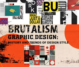
Brutalism Graphic Design: History and Trends of Design Style - Brutalism in graphic design is a design style trend that features modern font types that look large and bold, heterotopic, futuristic visuals, very striking colors and images. The brutalist font design is sans serif and bold, while the brutalist color palette is limited and flashy.
Designers with a brutal flow play with scale and perspective while maintaining flatness in visual design work to impress monumentalism. Brutalism designs tend to be highly functional, lacking a sense of culture and warmth.
History of Brutalism in Design
The history of the development of Brutalism can be seen in various periods of Modernism of the early 20th century. The Modernists' focus on the future and socio-economic development captured the imagination of artists and designers, along with the new technologies that were developing rapidly at the time.
The design styles of Cabbage, Futurist, and Vorticis had imagined a new reality in their art and design before the First World War, with their works featuring whimsical robot and poetry performances, portraits and landscapes composed of geometric shapes.
In addition to the term Art Brut coined by Dubuffet, Le Corbusier's French phrase used for raw concrete is le béton brut. Renowned Swedish architect Hans Asplund coined the term "New Brutalism" in 1949. The term was later popularized by British architectural critic Reyner Banham when commenting on the architectural work of Peter Smithson and Alison.
The Trend of Brutalism in Graphic Design
Currently, the trend of Brutalism in graphic design works is experiencing rapid development. Interestingly, the actual characteristics of Brutalism are unclear because they come from a diverse background of design styles. Based on the philosophical value of Brutalism of architectural design and art, it can be seen with the characteristics and aesthetic styles applied to graphic design and digital design.
The characteristics of design brutalism include the following:
- Strong concepts that break out of traditional or popular design trends
- Modularity or repetition of design elements
- Grainy, unfinished, or "draft" view.
- A game in texture and scale
- Simple and heavy sans-serif fonts, often using capital letters
- Using typography as a structural element
- Use white space and bold colors
- Mix black-and-white photography with graphic elements
- Underlying Pop aesthetic
- Stay true to the material and application of the design
The brutalist design style collaborates bold shapes and lines to create powerful designs that make a difference to the viewer.
This style arguably has the most profound effect on graphic design as a discipline because many good design principles fall under the category of Brutalism listed above.
Brutalism can also be a collaboration of various design genres that oppose design with traditional and structured concepts.
Brutalism and Anti-Design
Although brutalism usually focused on communication and functionality, its development in website design has plagued UX designers as a separate movement called Antidesign. Anti-design has an individualistic, chaotic, anarchic nature and does not stick to the rules of design.
The Difference Between Brutalism and Cyberpunk
Brutalism has a futuristic and heterotopic character, while Cyberpunk has a futuristic and dystopic nature. Cyberpunk can be recognized by the excesses of technology and digitizes almost everything.
Cyberpunk has a different visual language, such as neon lights, high-tech gadgets, futuristic modes, robots, flying cars, and other worlds.
Future dystopias feature virtual reality, old electronics, lack of natural resources, mass crime, and piles of garbage. Brutalism is about raw materials and authenticity whereas Cyberpunk is about excesses.
The Difference Between Brutalism and Flat Design
Flat design is a highly illustrative trend featuring two-dimensional designs or flat colors. Flat design is very versatile, as it can equally be used for corporate identity, visual web, books and all digital design.
Although both design schools share a minimalist approach, it all depends on the application of the design. In contrast, Flat designs tend to be soft and lightweight. The Flat style brings everyday life and imaginative scenes to life in cartoon fashion and is usually very expressive of human emotions.
The Difference Between Brutalism and Minimalism
It is difficult to distinguish between Brutalism and Minimalism, particularly in art, graphic design, and web design. Please note that these two design styles come from very different discourses. Brutalism is rooted in socialist idealism, utilitarian architecture, cross-disciplinary collaboration, and art.
Brutalism is basically a form of expression of social ideals, while Minimalism seeks individualistic aesthetic or philosophical ideals.
Read Next: Procreate Digital Art Application
Conclusion
Brutalism signifies a return to authenticity, rawness, innovation, and appreciation of existing materials. Design Brutalism can not only be seen in architectural design, but also in graphic design work. The brutalism of graphic design has resulted in several strategies for effective and expressive communication tools.
In graphic design, the Brutalist style has been and can be recognized by the public as a legitimate design style. Digital brutalism is used to create exciting online experiences.

💬 Comments