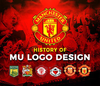
Manchester United Logo
History of Manchester United Logo Design. Manchester United or MU is one of the oldest and largest professional football clubs in the world from Great Britain. MU FC was founded in 1878 in Greater Manchester and owns Old Trafford stadium. This football club that currently plays in the Premier League has a long history. Since the establishment of the club nicknamed the Red Devils, MU logo design has undergone several changes.
History of Manchester United Logo Changes
Manchester is an industrial city but why is it that in the Manchester United logo there is always a picture of a ship with four sails?
The image in your logo is a depiction of the Manchester Canal, a waterway built to free the city of Manchester from dependence on the port of Liverpool. That is what makes the population of this city increase rapidly from 322 thousand people to more than a million people in 50 years. The industry in the city also became booming.
MU Logo Design; Trains Become Ships
Then what is the history of changing the famous Manchester United logo design from railway workers to a logo with a picture of a ship?
Newton Heath LYR FC (1878-1891)
MU FC was originally used the railway emblem, but the development of the city of Manchester due to the construction of the canal made the ship emblem known in the city of Manchester. At that time the club did not use the name Manchester so it still used their railway logo.
Newtoh Heath FC (1892-1901)
From 1892 the club changed its name to Newton Heath without the frills Lanchire and Yorkshire (LYR). At that time the logo was just simple and said NH on their uniforms.
Manchester United (1902-1940)
However, after Newton Heath went bankrupt, the club's investors changed and the club changed its name to Manchester United. The initial logo of MU used the image of two animals, namely a Lion and a Unicorn (a type of horse with one horn). The purpose of this logo is that this club runs as fast as horses and lions in victory.
Manchester United (1940-1960)
After the World War ended, United adopted a new coat of arms taken from the Manchester City Council Coat of Arms or the logo of the Manchester city government. This logo was also used by MU during the 1968 Champions Cup final.
The logo still remains with elements of two animals flanking a shield depicting a ship. It says the Latin Concilio Et Labore which means Wisdom and Effort. The point is that MU wants to achieve glory by means of wisdom and hard work.
Manchester United (1960-1973)
In the 1950s to 1960s, MU introduced their new logo. But it was only imposed in 1960. This logo is different from previous logos. This time it was quite simple without any more animal elements. The red color is dominant with the words Manchester United Football Club. The image of the 4-sailed ship still exists as a symbol of Manchester pride. This makes MU has become a Professional club.
MU Early History Nicknamed the Red Devils
Manchester United (1973-1998)
After the Sir Matt Busby era, United were nicknamed the Red Devils because of their fierce play on the field. The logo was changed in 1973 by adding the figure of the Red Devils holding a trident shown to embed the nickname in the MU logo.
Manchester United (1998- Present)
After transforming into a PLC or Go Public company, MU then changed the logo back. This time the words Football club were omitted, replaced by the words Manchester at the top and United at the bottom. Although now MU is not in the form of a PLC, the logo is still used and attached to your jersey until now.
In addition to these logos, there are still some special moments where MU modify the special logo at the final or certain commemoration parties on their oversized jersey. If you want to watch a live Manchester United match, you can visit and tour at Old Trafford stadium.
Read Next: 5 Important Elements In Creating A Logo Design
MU Logo Fonts and Colors
The typeface used in the Manchester United logo is a sans serif typeface, ITC Stone Sans SemiBold created by American typographer Sumner Stone while working at the Adobe Company. Here is the color code of the current manchester united logo:
Black:
Hex color: #000000 RGB: 0 0 0 CMYK: 0 0 0 100 Pantone: PMS Process Black C

💬 Comments